UI Design Principles

1. Contrast
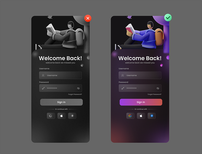
Contrast in design is one of the most important principles in creating an effective and eye-catching user interface using contrasting colors.
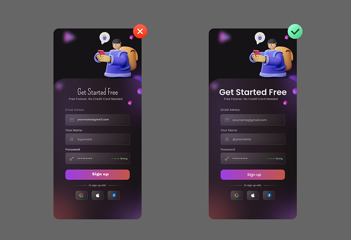
Contrast in design is one of the most important principles in creating an effective and eye-catching user interface using contrasting colors.
In simple terms, contrast is a noticeable difference between elements with comparable features, like light and dark, thick and thin, pastel and neon, and so on. By creating contrast, you can draw attention to certain areas and make your site more dynamic and visually appealing.
You can ensure that your users can see and read the information on their screens easily.


You can also use contrast to highlight important elements on your page such as call-to-action buttons or links but it’s not limited to colors you can also create contrast with shapes and sizes number.

2. Consistency
Consistency in UI design means that your UI elements, such as colors, fonts, icons, buttons, and layouts, are coherent and predictable across your product or service.
It also means that your UI behaviors, such as interactions, feedback, and navigation, are logical and intuitive for your users.
Consistency reduces confusion, frustration, and errors, and enhances usability, efficiency, and satisfaction.


3. Typography
Typography is more than just choosing the right words or fonts for your web or mobile UI, the text hierarchy, font scales, white space, color contrasts, and other visuals in your typography also help deliver specific messages about your product.
It is the art of organizing typefaces on the interface to make all copies readable, legible, and scalable to the audience. Visually appealing typography sometimes catches the users’ attention and increases the interface conversation rate effectively.


4. Color
Colors are a way of generating emotions and can engage consumers. When it comes to designing an engaging user interface, color is considered to be the most important aspect.
Can you imagine a user interface design without any color it would look quite boring and would be hard to navigate color can be used to highlight important elements create a good visual hierarchy help with navigation and express the personality of the brand that’s why color plays an important role in ui design.


Colors are a very important part of the design process. As designers, we understand the struggle to find the right colors as well as color combinations.
For more details about the color, you can read this blog: Color Concept in Design.
5. Visual hierarchy
Visual Hierarchy in Design refers to the arrangement and presentation of elements within a user interface in a way that guides users’ attention, understanding, and interaction. It is a design principle that uses various visual cues such as size, color, typography, and spacing to create a structured order of importance among the elements on a screen.
By establishing a clear visual hierarchy, you can lead users through the content, making it easier for them to understand the information, navigate the interface, and complete their intended tasks.
The goal of visual hierarchy is to direct users’ focus to the most important and relevant elements, helping them to quickly grasp the content’s structure and significance.


There are a few different ways to create a good visual hierarchy.
— Size: Larger elements will naturally draw more attention than smaller ones this is why it’s often used for headlines and calls to action.
— Color: Bright and saturated colors will usually attract more attention than muted or desaturated colors.
— White space: More space between elements will draw more attention to their point.

Alignment an element with a different alignment from others will attract more attention proximity elements that are placed closely together appear more related.

